09 – 20

Blackburn Davis Financial

TYPE
Web Design
Brand Development
Creative Direction
DESCRIPTION
Financial Business
Wealth Management
Canadian Focused
YEAR
2020
06- BlackburnDavisFinancial-featured-project
See live version:
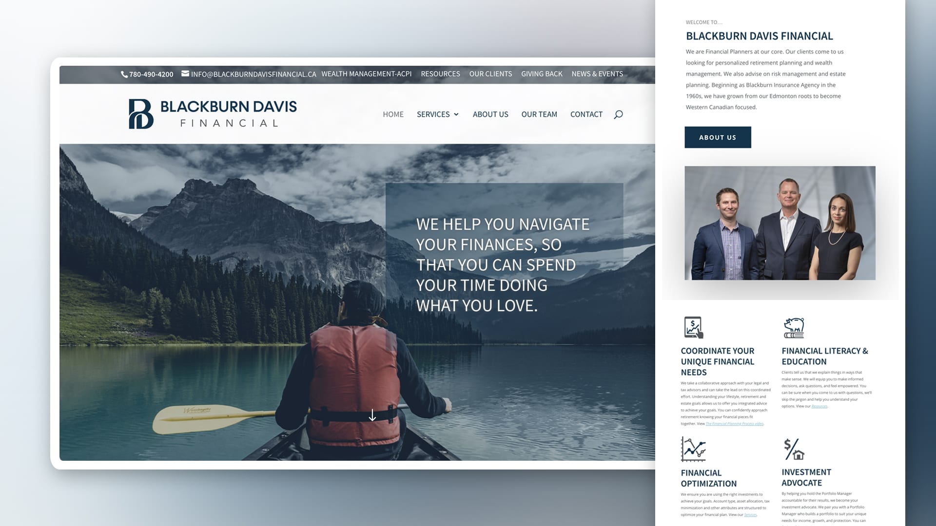
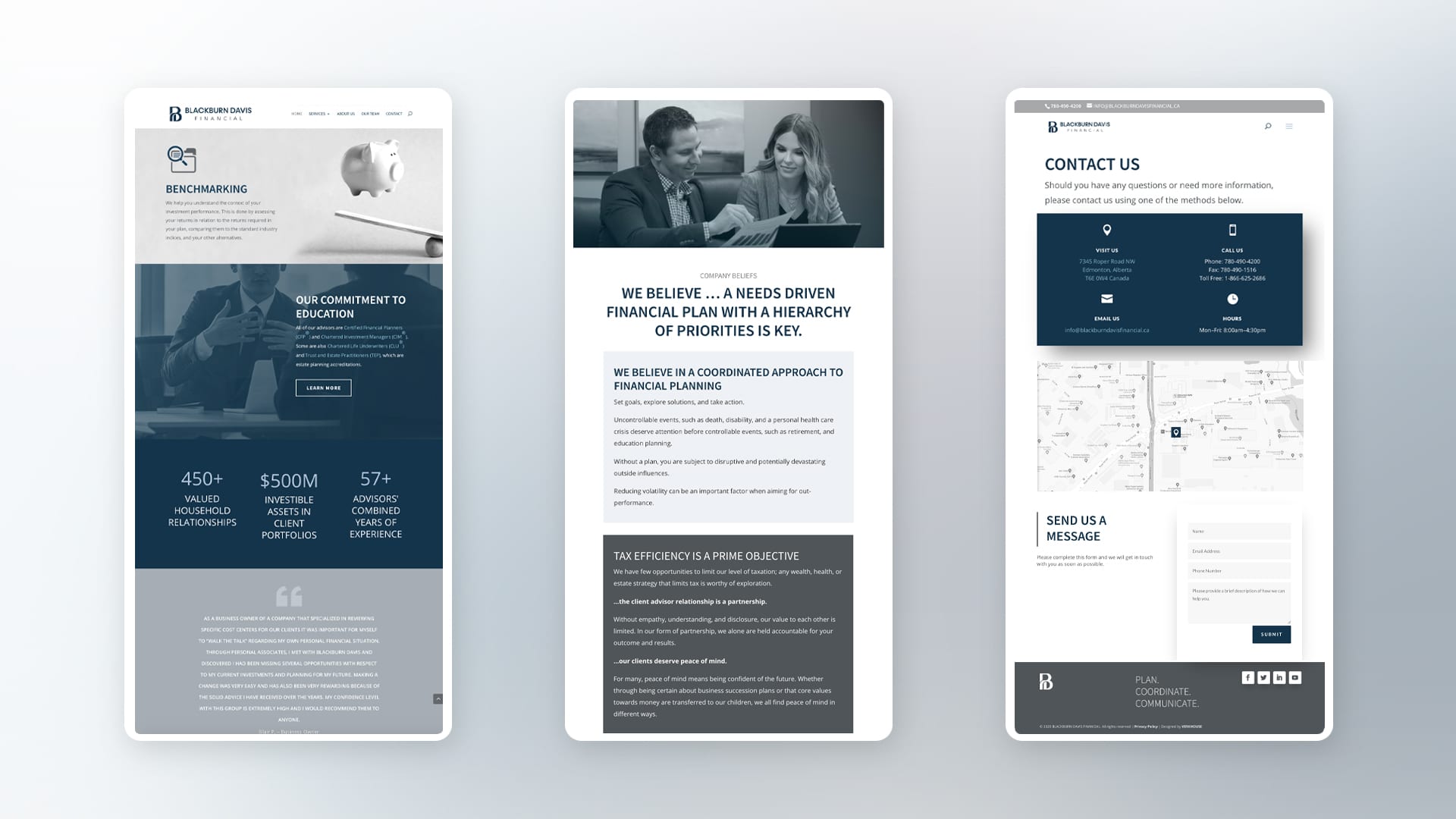
Blackburn Davis Financial is a leader in managing wealth with personalized financial needs for individuals and business owners in Canada. They wanted to modernize their identity and create a cohesive visual system to cover all channels of communication. They contracted Verkhouse to direct and execute their project, with that in mind I started with redesigning their image from scratch, revitalized their decade-old brand, designing and developing solutions for all their marketing materials, from catalogues, show displays to web design, online materials, video and interactive presentations.
Client: John Davis, Stephen MacDonald
Year: 2020
Scope of Work: Brand Development + Web Design
Location: Alberta, Canada
10-blackburndavis-financial-branding
The corporate logo is presented through the use of colour as well as shape and form. The two colours are Dark Blue and Hard Grey, a fresh appealing blend of colours chosen for their strong combination – modern, classic, timeless.
09-rebrading-blackburndavis-by-verkhouse
06-rebrading-blackburndavis-by-verkhouse
11-rebrading-blackburndavis-by-verkhouse
10-pure-branding-mockup-vol2-us
blackburn-davis-brandguidelines-01
Dark Blue is used as main color, meant to represent elegance, authority, intelligence, trust and loyalty.
Brand_Manual_BDFW_20204
Brand_Manual_BDFW_20208
blackburn-davis-brandguidelines-05
blackburn-davis-brandguidelines-03
Brand_Manual_BDFW_20207
BDF-website-01mockup
BDF-website-02mockup
BDF-website-03mockup
Blackburn Davis

Non-commercial project. All content used belongs to their respective owner.

CREDITS
Branding + Creative Direction:
Dana Rosendal
dot-black

Always learning.

Always growing.

To comply with my non-disclosure agreement, 
access for relevant projects is available upon request.